Maastricht UMC+
Architecten aan de Maas
Tiled floors as a form of traffic system
‘Floors in a foyer are like business cards. They set the tone and ensure visitors can find their way in large buildings; you know where you are so you feel more comfortable and at ease. You can notice this in the new Maastricht University Medical Centre (MUMC+) building,’ says architect Luc Nooijen, who works for Architecten aan de Maas in Maastricht. ‘When I look at the building now – six months after it was commissioned – I can see that its modernity and strength suit the very light, clinical appearance of the old building extremely well. We’ve been able, despite the extensive requirements, to create a building that’s retained its airiness while still exuding the warmth and relaxation that can be expected from a contemporary style.’
Flooring for residential and access areas
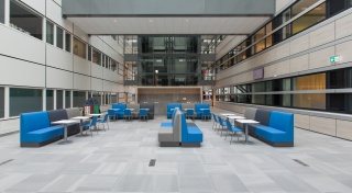
According to Nooijen, ‘We felt the old and new buildings needed to join together seamlessly, and the glass hallway in the new building had to feel like it naturally belonged with the public space in the rest of the hospital. This was all made possible by the eye-catching floor blending all the public areas together – a feature that was more decisive for us than even hygiene, for example. This might sound crazy for a hospital, but the tile flooring is actually for the general residential and access areas, so aspects such as its connection with other areas, safety because of the large amount of footfall, maintenance, and ambiance were much more important for us.’
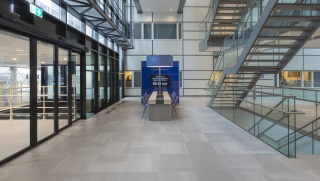
‘I must admit that choosing Core Collection Solids was in fact pure luck. Indeed, we’d already opted for Core Collection Terra, which is used in the hospital entrance, when José Maase, designer at Mosa, called us to ask if we wanted to see and consider a newly designed range.’ Maase adds, ‘We were developing a new tiled flooring concept, and we always like to discuss new ideas with architects, explaining our thoughts and gauging their feedback. Luc reacted very positively to Core Collection Solids straight away, and saw some possibilities for MUMC+.’ ‘I wanted a vibrant but subtle floor,' explains Nooijen, 'which could possibly be added to the existing building at a later date. Core Collection Solids, in the light grey colour we opted for, provided this opportunity. We then considered it very carefully together with our client, which was made much easier by Mosa not just suggesting looking at the tile in their showroom, but also having it laid in two rooms in the hospital with a surface area of 50 square metres. We then gauged the reactions of users and experts in facility management, technology, real estate, accommodation, and the service industry. It also meant we were able to test the tile out in terms of its quality, aesthetic, colour, shading, and future durability.’
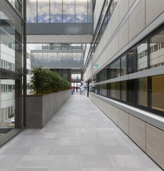
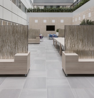
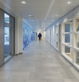
‘Even though we could have easily indicated walking directions on the floor using the shading on the 60 x 60 centimetres Core Collection Solids tiles, we decided not to do so. Instead, we positioned the tiles at right angles to each other, which gave the floor a natural, luxurious, timeless character, while at the same time apparently enlarging the area slightly,’ says Maase. ‘The technical qualities of Core Collection Solids are comparable with our other series; Core Collection Solids is very wear-resistant and has a smooth, dimensionally stable surface, which is easy to clean. This last quality also applies for the joints, which are very narrow and flat. We’re also very enthusiastic about the effect produced by the random positioning of the shading. The space looks more neutral because this laying method makes the floor look subordinate, despite its monumental appearance, to all the functions the building needs to cater for. So you can see how valuable the interaction and cooperation between Mosa and architects can be.’

Highly technological and welcoming feel
The task given to Architecten aan de Maas was no easy one. A new building had to be created – next to the still iconic hospital first used in 1991 – which could accommodate similar functions. It wasn’t just that there was only a small amount of ground available for this, but also that the requirements were very ambitious. Nooijen says, ‘We made maximum use of the space inside the urban planning architecture, and took all our client’s aesthetic prerequisites on board. The new building couldn’t simply be a plaster to cover the high-profile, old building; we had to create a coherent whole, with a complementary ambiance, without it being a copy. It also had to have the same ‘state-of-the-art’ feel, both for its interior and its exterior. This led to a fascinating search and exceptional solutions, one example of which is the south façade that’s fully covered in solar panels. This provides the MUMC+ with energy and also makes a statement about its role in society and operational management.
It’s the architect’s job to get the client on board with these choices, not just in terms of design and materials, but also for the overriding image you want to portray as a designer. It was very clear to us right from the start that this building needed to have a welcoming and reassuring, comforting, warm feel, and this appealed to MUMC+ too. Paramount in our vision was the fact that natural light had to be able to penetrate right into the heart of the building, just like it does in the courtyard and glass hall in the old building. This was a big challenge. We had to use the square metres available to us very carefully, taking the wide range of functions – such as the wards, offices, logistics centre, and operating theatres – into account. We worked with light, wood-print, interior façades to create the right atmosphere, and perforated materials to absorb sounds, which is why we chose Core Collection Solids. It’s a warm, matte tile. I can tell you that the limited space meant we had to think very long and hard, but after an extensive process of drawing, adding, and drawing again, we’ve managed to produce a relaxed and contemporary feel while also maintaining the good relationship with the old building we’d imagined. It makes me very proud.’
Do you want to know more about our Core Collection tiles and what they can do for your project? Discover everything about the unique Core Collection Solids tile series and download our free brochure.
View Core Collection SolidsProject details
| Project: | UMC Maastricht |
| Architect: | Architecten aan de Maas |
| Location: | Maastricht (the Netherlands) |
| Surface area: | 5.000 m2 |
| Completion: | 2017 |
| Mosa series: | Core Collection Solids |
Inspiration
More information
We set high standards for the advice and support. This means that we actively aim for dialogue and that we are interested in what interests you. Do you have any questions about this project or would you like to discuss the options for your project?
Contact Mosa