De Passage Den Haag: dotting the void
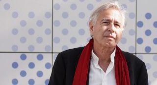
An interview with Joel Rutten, lead architect and director at Bernard Tschumi Architects, reveals more about the concept and geometries that lead to the iconic design that currently houses around 10,000 m² of retail space and 118 accommodation suites in a Suite Novotel hotel.
De Passage
Bernard Tschumi
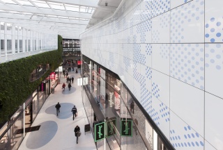
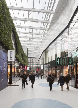
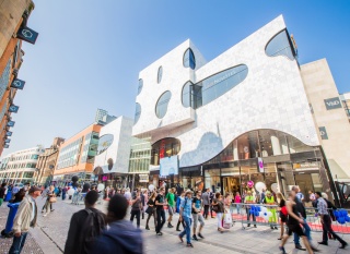
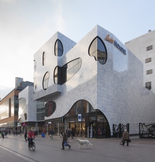
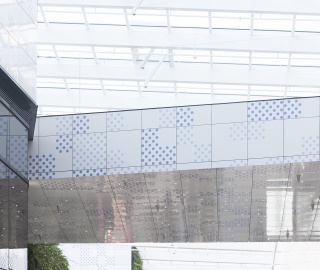
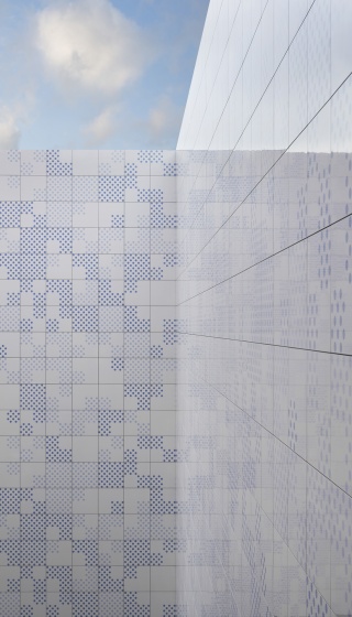
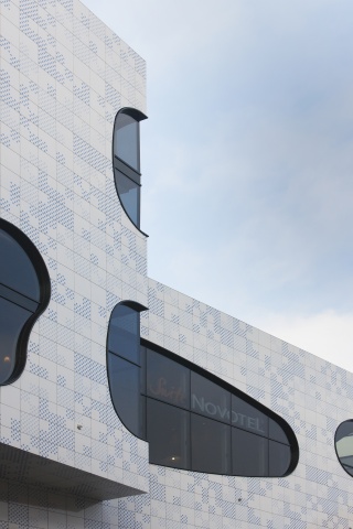
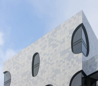
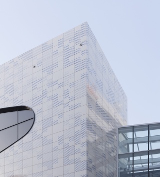
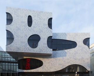
Renowned architectural studio Bernard Tschumi Architects were appointed the task of designing a new iconic building in the centre of The Hague in The Netherlands. Client Multi, the global development company, wanted the architects to create a building that would be adaptable for future programme, create a light and open environment for visitors and at the same time hold a strong visual identity that related to The Netherlands. What evolved is the ‘De Passage Den Haag’ - a long, light-filled passage, connecting two main shopping streets, with two buildings either side that define the concept through a unique exterior. The idea of openness and identity can be experienced through the highly glazed white Mosa ceramic facade tiles that are embedded with blue dots - an ode to Delftware, white and blue pottery made in The Netherlands from the 16th Century, and to the sky, which is reflected in the tiles itself.
There is a lot of emphasis on the passage in-between the two buildings.
Joel Rutten: The role of the passage, originating from Northern Europe was to provide shelter in the winter to protect people from adverse weather and to provide refuge to people in a light and open way. Although we were creating a number of spaces for shops and accommodation, we wanted to maintain the function of the passage as a breathing space for people in the city. It's a unique feature because it has more of a function than itself - it works on a city-scale.
What was the concept behind its design?
What we tried to define for the passage was actually a void. That was the major action we had to facilitate in the design - for it to be open and flexible and not defined by its content. The central arcade is kept open through a largely glazed top, whilst the main building is formed by the idea of carving into one volume.
How did you enable this - to create a void whilst creating a space with character and an iconic physical identity?
Through the facade. The content of the building needed to be flexible but the exterior elements needed to create the presence. We didn't want anything heavy that would make the space feel fixed - it had to give the feeling of being light, open and transparent.
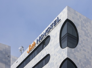
Many people reference the exterior in relation to the sky and clouds and somewhere in the background this concept was discussed. These elements have influenced the design - the organic nature of the windows and the whiteness and blues on the Mosa ceramic facade tiles.

How important was it to retain Dutch heritage in the design, owing to the fact that a lot of the users would be international as The Hague is considered the centre for culture in The Netherlands.
From the onset, we were interested in exploring what 'Dutch' is and what makes The Netherlands so particular in the world. Our initial studies created an image of something unique, pragmatic, creative and efficient. We were also very interested in the Dutch culture in The Hague and researched what could benefit the design in its location. The approach was very much towards inviting an international crowd though, so the local identity was considered more in terms of The Netherlands. That's where the idea of using Delft blue first entered. Whilst not being in Delft, it's a real signifier of The Netherlands and formed a point of discussion for some of the most important parts of the design - like the exterior. This research also lead us to Mosa, with 130 years experience in producing unique ceramic tiles in The Netherlands, it seemed quite relevant to have them involved in the process.
The exterior is a real mixture of geometries: square and circular.
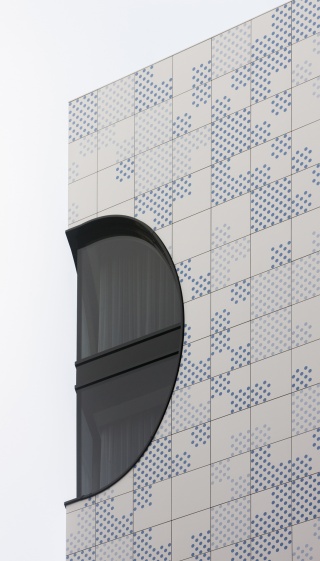
It was important to create some kind of tension on the outside and this was executed through two different types of logics: angular and free form. The confrontation between these logics creates moments. The angular was brought about by the building's overall form and the precise composition of the Mosa ceramic square tiles. The other is the free form, brought about by the fluidity of the windows and the circles on the tiles. The tiles heighten the relationship of these logics as they include both, a square tile embedded with blue dots, somehow creating continuity without breaking the tension.
What was the idea behind the envelope - the overall concept?
The first idea was to have an envelope that was like a shrink-wrap around the whole building. It had to have an abstract nature, not to fulfil a purpose, as we defined the interior as a void. What evolved was the idea of 'the clouds' - the windows - which created an impression of free forms moving around the building. And then this against the strict grid of the tiles created a playful exterior.
The windows express very adventurous and difficult geometries.
One of 'the clouds' goes through three different facets with two angles incorporated, so in terms of geometries, it is complex. We wanted it to read as a smooth transition though, open and flowing, which of course required a high level of technical output. It was challenging but we always had this idea of blurring the rigidity of the skin - disturbing the geometry of the building to create interesting moments.
From what point did you decide to use ceramic tiles for the facade? Did you consider other materials?
This was an odd scenario as little by little the idea of using blues and whites to represent clouds led to Delft blue, and then the Delft blue led to the tiles. So the colour started the story but the material also really fit into our work ethos. We like using materials that are real - that have that raw quality about them: exposed concrete, steel, and ceramics. Showing the possibilities of raw materials rather than a material imitated to be another material is something that is very important to us.
We approached Mosa to explore the possibilities of designing a uniquely decorated tile that could express Dutch culture as well as the evolving nature of raw materials. What first attracted us was the quality and cradle-to-cradle (C2C) properties of the tile, making it a durable and sustainable material for the exterior. It felt very natural to go with Mosa ceramic tiles in the end. The material's structure, finish and ability to hold a graphical impression were winning factors.
So you worked back from the colour to the material as an aesthetic choice?
At some point we played with having coloured glass panels, fritting, stained glass. But it felt very natural to go with ceramic tiles in the end - the material's structure, finish and ability to hold a graphical impression were winning factors.
What influenced the design on the tiles?
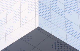
The Delft blue became a bit of a running theme. It allowed us to link to the local context as well as The Netherlands, but because we wanted to symbolise openness and something new we needed to go beyond the borders of just blue tiles. It would have been too crude to cover the large volumes in this way so we designed a solution: blue dots across white ceramic tiles to break up the continuity of colour and give air to the exterior pattern.
How did you create the pattern across the exterior? Was there a method to the dotting?
The pattern is random but there was a method to create the fluidity you can see, even though each tile was arranged according to a computer program. Mosa created 8 different customised tiles that fall into two colour families - light blue and darker blue dots on a complete white tile. The dots are arranged across a 60cm x 60cm tile in four patterns. By rotating the tiles 180 degrees, the illusion of more tiles is created. What this meant was that you can have so many combinations and ways of connecting that you don't read a pattern anymore, but an entire ceramic skin.
People liken the facade's appearance to pixels, and we like that people can interpret it in so many ways and this goes hand in hand with its reflective quality. Glazed tiles offer the design this extra quality - the light the Mosa ceramic tiles catch and reflect changes the exterior in a very interesting way. Sometimes you'll notice a subtle reflection of the sky on the tiles, and at other times you'll experience the movement of the clouds passing by - it makes the building feel ethereal.
There's a seamless quality about the facade. Was it difficult to achieve this?
We had to put a lot of trust in Mosa - they assured us that we could achieve what we wanted, a minimum distance between the tiles, with a minimum tolerance. This was a big decision as Dutch building laws meant that previous systems we had used with ceramic tiles - direct glue contact with the main structure - was not possible. We required a mechanical fixing system that would accommodate the freezing and thawing cycles within the Dutch climate. At one point we were considering banding on the facade, to give tolerance for any shifts, but Mosa assured us that they could deliver a system without banding, in line with our original elevations - and they delivered it perfectly.
It's not just due to the placement of the tiles that make it appear seamless though. The way the tiles were produced literally made the surface seamless. The blue dots are applied to the glaze before the baking process, setting the dots within the white tile structure as opposed to sitting on it. This produces a ceramic tile that is more durable in its structure and smooth in its finish, creating a low maintenance solution with a long life span. This is the level of detailing that Mosa offered - beyond the necessity and pushing the capabilities of a ceramic tile.
How have you considered sustainability in the design?
We are naturally conscious of this in our design process. There is a reason that the glass is tinted grey - it performs well in reflecting heat and at the same time we've considered a different solution for heat gain in the North. There is so much attention to these passive strategies towards sustainability that this building was awarded a BREEAM-NL Nieuwbouw ‘GOOD’ design certificate.
All of our strategies are about balance, without the input of one overall 'feature'. There has to be a compromise, because when you chose to use raw materials, you need to make additional efforts that aren't necessarily technological. The materials we use show environmental characteristics though - like the Mosa ceramic facade tiles, which are cradle-to-cradle certified. When the material providers show their responsibility towards the environment, again, the building has the capability to be more sustainable.
Project details
| Project: | De Passage |
| Architect: | Bernard Tschumi Architects |
| Location: | The Hague (the Netherlands) |
| Surface area: | 2014 m² |
| Completion: | 2013 |
Inspiration
More information
We set high standards for the advice and support. This means that we actively aim for dialogue and that we are interested in what interests you. Do you have any questions about this project or would you like to discuss the options for your project?
Contact Mosa